
VidaLens Focus
We designed a UI/UX app prototype, VidaLens Focus, a seamless digital companion for contact lens wearers. Serving as a hub for managing lens usage, placing orders, tracking wear time, and accessing support, it is built with clarity, empathy, and accessibility in mind and reflects our vision for user-centred HealthTech design.
Project Background
This project continues our exploration into how design can enhance emerging HealthTech experiences. We noticed a growing trend in Connected Health, products that merge physical treatments with apps, wearables, and remote tools for more efficient, accessible, and proactive care. The VidaLens Focus app aims to explore this trend.
As with all EmpaVis Media projects, we grounded our concept in our core values: Empathy, Clarity, and Relevance.
We wanted VidaLens Focus to feel familiar, intuitive, and uplifting - more like a wellness or fitness app than a medical tool. It shouldn’t intimidate wearers or feel like a chore. Instead, it encourages engagement, empowerment and educated use.
The Challenge
The global contact lens market includes over 140 million wearers (1), ranging vastly in age, experience, and tech fluency. For our design to work, it had to be instantly usable, with no learning curve, need for training, or intimidating medical overtones.
We also noted a gap in existing apps: many were narrow in scope, focusing on either product reordering or basic reminders. But users have varied priorities. Some care about tracking wear time, others want fast reordering and many want reassurance or quick support.

Our Approach
We structured the app around three key areas:
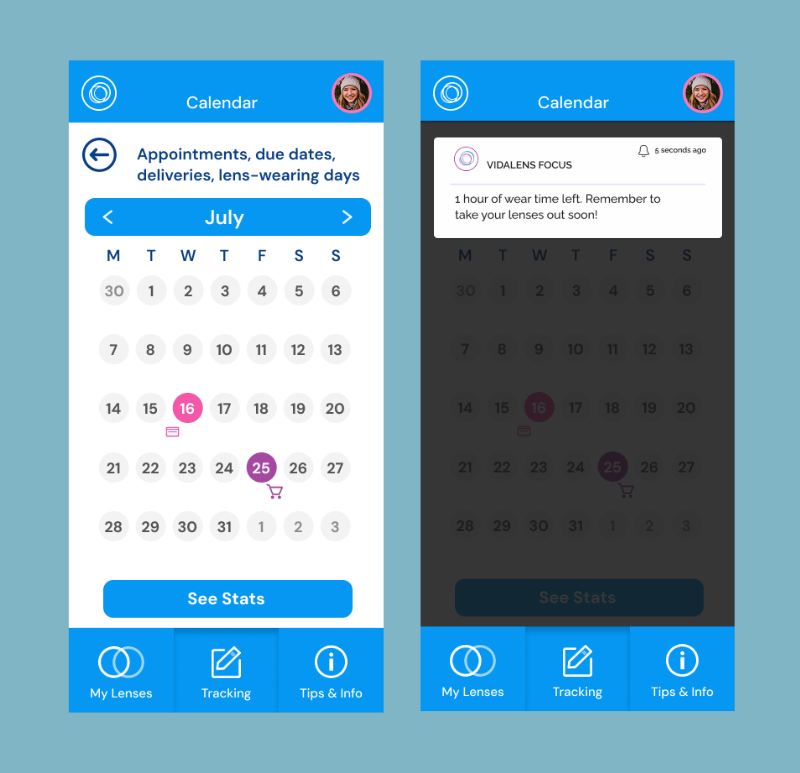
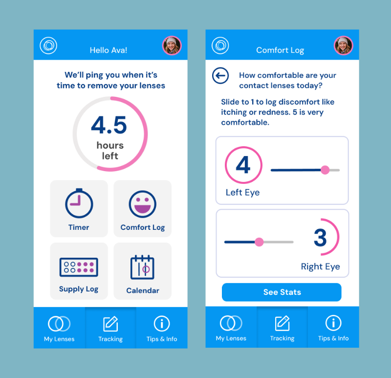
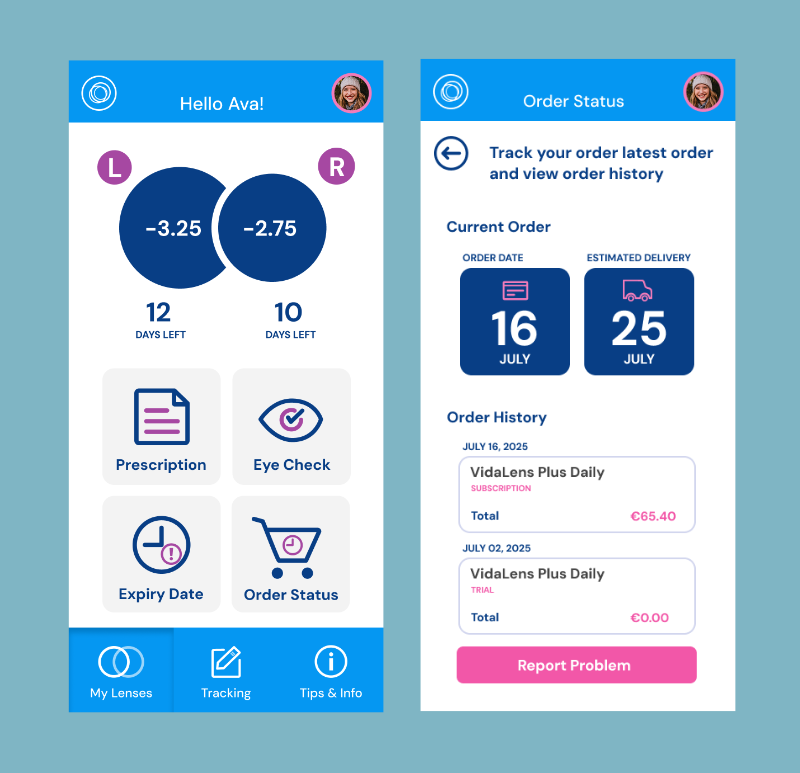
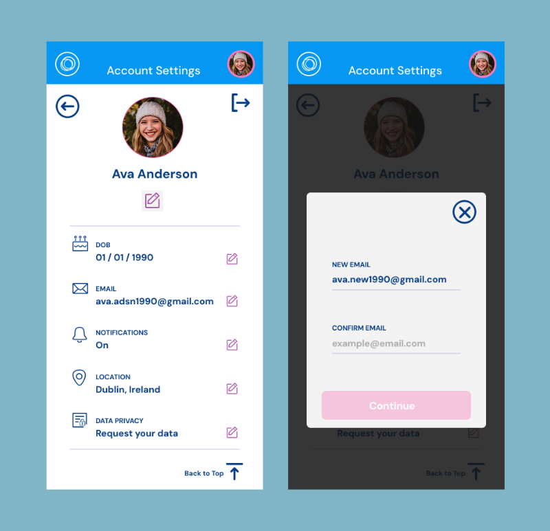
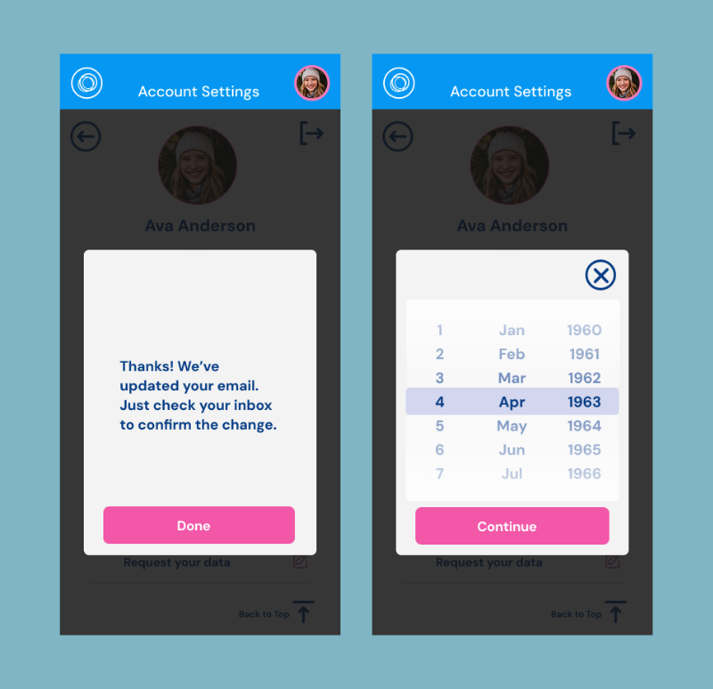
My Lenses (user info & prescriptions)
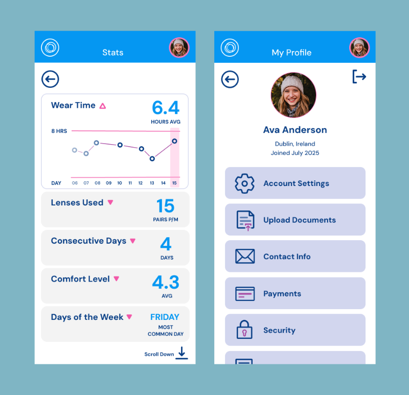
Tracking (wear time, calendar, usage insights)
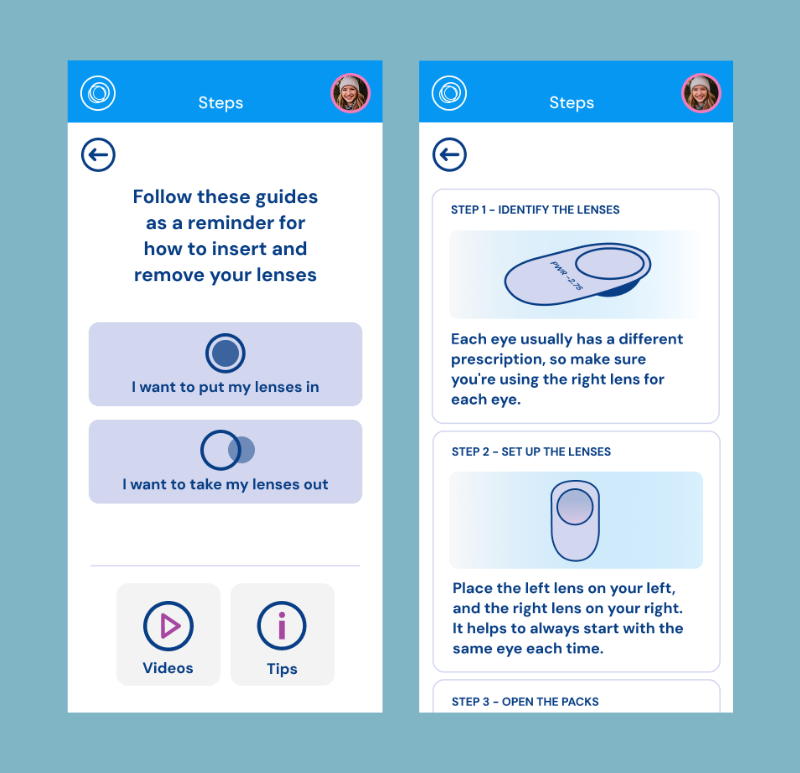
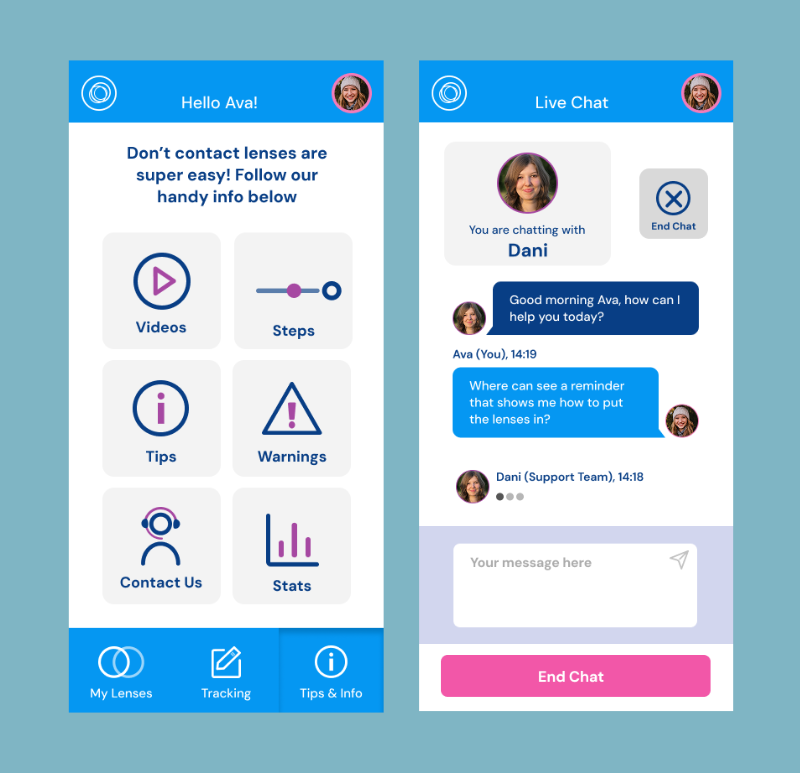
Tips & Info (education, support, and FAQs)
These are accessible with a bottom navigation bar, keeping all major functions within thumb’s reach. Deeper interactions, like order tracking or chatting with support, are nested within these main areas.
Key design choices included:
Minimal, purposeful colour: Inspired by more identifiable health apps, we used blocks of colour sparingly to highlight key actions and reinforce brand identity, keeping the interface clean and focussed.
Playful visual style: Friendly illustrations, rounded type, and warm language invite users in. The app should be fun to use and be empowering.
Information hierarchy: Essential data like lens strength and remaining wear time are front and centre in the main sections. Subsections are grouped and labelled for ease of use.
Icon-first navigation: To make interactions fast and accessible, we paired key actions with familiar, intuitive icons that can are immediately recognisable and help navigation, especially important in a vision-related product.
Our research drew on publicly available insights about what matters most to contact lens wearers, grounding our features in real-world needs.
Brand
VidaLens blends the Spanish word vida (life) with lens, evoking the lease of life that contact lenses can offer. No fogging glasses. No barriers to activities and sport. Just clarity, comfort, and confidence. The brand colours with vibrant pinks and blues, signal vitality and joy, a balance between masculine and feminine style. The logo uses a playful sans-serif typeface with circular forms that echo the lens’ shape.
Impact and Outcomes
Our belief is that HealthTech should feel human. In the real world, this prototype would:
Enable users of any age to manage their vision care effortlessly
Reduce friction between wearers and their lens routines
Support varied user goals
Establish a memorable, emotionally resonant brand experience
Lessen the fear and mystery around contact lenses for beginners
We designed VidaLens Focus not just as an app, but as a vision of what great digital health tools can feel like: warm, clear, and life-enhancing.
(1) Ezinne NE, Bhattarai D, Ekemiri KK, et al. Demographic profiles of contact lens wearers and their association with lens wear characteristics in Trinidad and Tobago: A retrospective study. PLoS One. 2022;17(7):e0264659. Published 2022 Jul 22. doi:10.1371/journal.pone.0264659
Disclaimer: This fictional demo was created for portfolio purposes, based on publicly available information about contact lenses, an existing medical technology, and user behaviours.